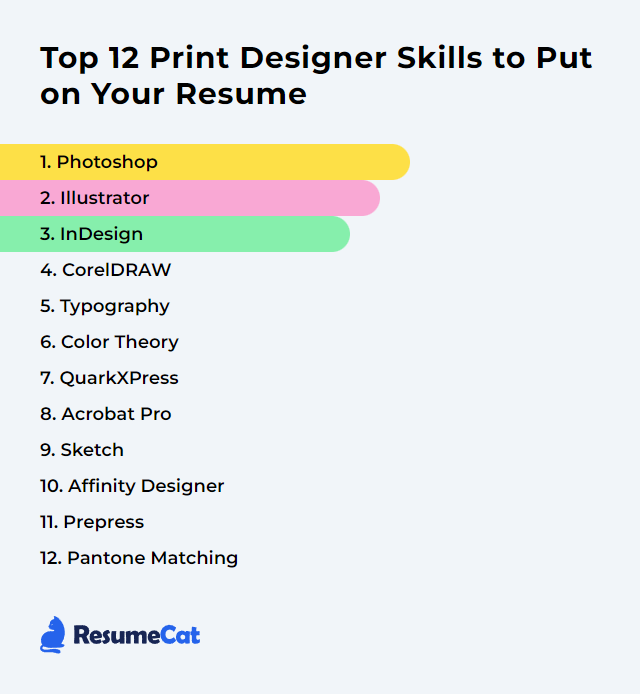
Top 12 Print Designer Skills to Put on Your Resume
In print design, employers scan for a nimble mix of craft and control. Show that your resume isn’t just pretty—it's production-proof. Below are 12 core skills that broadcast you can think in ink, wrangle color, and ship files that sail through the press without drama.
Print Designer Skills
- Photoshop
- Illustrator
- InDesign
- CorelDRAW
- Typography
- Color Theory
- QuarkXPress
- Acrobat Pro
- Sketch
- Affinity Designer
- Prepress
- Pantone Matching
1. Photoshop
Photoshop is a powerhouse for editing and compositing raster images, retouching, and preparing pixel-perfect assets that print crisply and land on spec.
Why It's Important
Print demands exacting control over tone, detail, and color. Photoshop lets you fine-tune images, proof colors against print profiles, and output at sizes and resolutions that survive the press.
How to Improve Photoshop Skills
Color management first: Work with proper ICC profiles, soft proof, and check gamut warnings so your on‑screen vision maps to paper.
Non‑destructive workflow: Lean on adjustment layers, masks, and Smart Objects. Revisions become painless, quality stays intact.
Print‑ready resolution: Aim for effective 300 ppi at final size. Sharpen last, for the target stock and press.
Type control: Use paragraph/character styles and optical kerning; convert to shapes only when required by the printer.
Proof before print: Soft proof, then run a small hard proof. Catch shifts early—especially skin tones and deep shadows.
File hygiene: Name layers, tidy groups, embed or link assets consistently, and package when handing off.
How to Display Photoshop Skills on Your Resume
2. Illustrator
Illustrator is the standard for vector artwork—logos, icons, spot-ink graphics, and layouts that need infinite scalability and surgical precision.
Why It's Important
Vectors print razor-sharp at any size. With exact control of paths, type, and color swatches, you get consistent results across runs and substrates.
How to Improve Illustrator Skills
Pen Tool mastery: Clean bezier curves, minimal points, perfect joins. Your print edges will thank you.
Swatches and spot colors: Build global swatches, use Pantone where needed, and keep tints consistent via styles.
Bleeds and artboards: Set bleeds from the start. Use multiple artboards for families of pieces and unified exports.
Appearance and Graphic Styles: Stack strokes/fills non‑destructively; apply styles to keep a system coherent.
Shape Builder and Pathfinder: Construct complex marks cleanly; avoid stray points and overlaps that can bite at RIP time.
Prepress checks: Outline only when requested, verify overprints, expand effects as needed, and export to PDF/X profiles when appropriate.
How to Display Illustrator Skills on Your Resume
3. InDesign
InDesign is the layout engine for multipage documents—brochures, magazines, catalogs, books—with tight typography and production-aware controls.
Why It's Important
Complex layouts need master pages, styles, and pagination that won’t unravel late in production. InDesign keeps long documents consistent and print-ready.
How to Improve InDesign Skills
Styles everywhere: Paragraph, character, object, and table styles keep typographic systems consistent and lightning fast to update.
Masters and parent pages: Lock in grids, folios, and recurring elements so changes ripple cleanly.
GREP and nested styles: Automate the fiddly formatting. Less manual touch, fewer errors.
Preflight and packaging: Catch overset text, missing links, and color issues early; package fonts/links for handoff.
Anchored objects and tables: Keep images and data glued to the right text, even as copy reflows.
Export with intent: Set bleeds/marks, pick PDF/X standards, and flatten or keep transparency per printer spec.
How to Display InDesign Skills on Your Resume
4. CorelDRAW
CorelDRAW is a vector and layout suite widely used in signage, apparel, and general print workflows—especially where spot colors and large formats are common.
Why It's Important
It blends illustration, layout, and prepress tools that fit many print shops’ daily realities, from decals to dielines.
How to Improve CorelDRAW Skills
Vector discipline: Clean paths, proper joins, minimal nodes. Complex art, simple structure.
Color control: Set CMYK/spot palettes accurately, manage document color settings, and stick to global swatches.
PowerTRACE: Convert bitmaps with care—simplify nodes and check corners so cutters and presses behave.
Prepress features: Use overprint preview, check hairlines, set bleeds, and export to PDF/X with the right settings.
Templates and Styles: Build templates for recurring formats; style sheets keep rhythm and consistency.
How to Display CorelDRAW Skills on Your Resume
5. Typography
Typography is the orchestration of letterforms and spacing so words read effortlessly and look inevitable on the page.
Why It's Important
Type carries voice, hierarchy, and pace. In print, it’s the difference between skimming and staying.
How to Improve Typography Skills
Establish hierarchy: Size, weight, contrast, and spacing that guide the eye without shouting.
Pair with restraint: Two families, maybe three. Complement, don’t compete.
Micro‑type: Kerning, tracking, leading, optical margin alignment, hyphenation/justification tuned for the column width.
Use OpenType features: Ligatures, small caps, old‑style numerals—careful details that add quiet polish.
Mind line length: Roughly 50–70 characters per line for comfortable reading; adjust leading to match.
Proof on paper: What reads fine on a screen can sag in print. Always print small samples.
How to Display Typography Skills on Your Resume
6. Color Theory
Color theory translates emotion and function into palettes that reproduce well on real substrates—ink, toner, coatings, and papers with their own quirks.
Why It's Important
Color guides attention and mood. In print, it also has to survive conversions, paper color, ink limits, and lighting conditions without drifting.
How to Improve Color Theory Skills
Know your models: Work in CMYK for print, use spot colors when needed, and understand when conversions will shift hues.
Harmony and contrast: Build palettes with deliberate relationships—complementary, analogous, triadic—balanced by value and saturation.
Substrate savvy: Uncoated stock softens colors; coated pops. Adjust ink coverage and curves accordingly.
Calibrate and profile: Monitor, proofing device, and printer profiles aligned to cut surprises.
Accessibility: Ensure sufficient contrast and avoid confusing combinations for color‑blind readers.
Test swatches: Print small patches on the actual stock, under D50 lighting if possible. Trust the print, not just the preview.
How to Display Color Theory Skills on Your Resume
7. QuarkXPress
QuarkXPress remains a capable layout tool used in some publishing and production environments for sophisticated page design and typography.
Why It's Important
In workflows where Quark is standard, proficiency means you can jump in, maintain templates, and export reliable, press‑ready files.
How to Improve QuarkXPress Skills
Style sheets and masters: Codify typography and recurring elements to keep long docs consistent.
Color and output settings: Set up CMYK/spot workflows, manage profiles, and lock in PDF presets.
Job Jackets and Preflight: Validate specs early—dimensions, fonts, images, and color usage.
Typography tools: Fine-tune H&J settings, keep widows/orphans in check, and balance ragged edges.
Asset management: Link hygiene and packaging keep handoffs smooth and error-free.
How to Display QuarkXPress Skills on Your Resume
8. Acrobat Pro
Acrobat Pro is the print checkpoint—preflight, output preview, font embedding, and PDF/X export to keep production predictable.
Why It's Important
Most jobs land as PDFs. Acrobat is where you verify separations, overprints, transparency, and file integrity—before they hit the press.
How to Improve Acrobat Pro Skills
Preflight profiles: Validate against PDF/X standards, flag low-res images, RGB leftovers, and missing fonts.
Output Preview: Inspect separations, overprint, total ink coverage, and simulate paper color.
Fixups and optimization: Embed/subset fonts, flatten where needed, and reduce size without killing quality.
Layers and versions: Use optional content groups for language or version toggles in a single PDF.
Comments and review: Centralize feedback, compare document versions, and track changes cleanly.
How to Display Acrobat Pro Skills on Your Resume
9. Sketch
Sketch is a vector design app primarily aimed at digital UI work. It can handle layout and vector illustration, but print workflows require extra care.
Why It's Important
If your practice straddles brand systems across screen and print, Sketch can generate clean vector assets—just plan your print handoff wisely.
How to Improve Sketch Skills
Vector precision: Keep shapes clean, snap to pixel/grid, and organize symbols for reusable brand assets.
Print considerations: Sketch is RGB‑centric; export to PDF/SVG and convert to CMYK in Illustrator, InDesign, or Affinity as needed.
Resolution awareness: Export at sufficient size; ensure effective 300 ppi when rasterizing imagery.
Bleeds and trims: Mock bleeds via oversized artboards and guides; finalize bleeds during PDF prep in a print‑focused app.
Handoff discipline: Outline type only on request, include brand palettes, and verify color conversions before sending to print.
How to Display Sketch Skills on Your Resume
10. Affinity Designer
Affinity Designer blends vector and raster personas in one app, with robust CMYK and spot color support, making it a solid ally for print work.
Why It's Important
You get precise vectors, pixel control, and professional export options—without leaving a single environment.
How to Improve Affinity Designer Skills
Personas fluency: Jump between vector and pixel personas to retouch textures while keeping core vectors crisp.
Color accuracy: Set document profiles to CMYK, use spot swatches, and audit palettes before export.
Print setup: Define bleeds, margins, and grids early; use artboards for multi‑piece campaigns.
Vector finishing: Expand strokes where needed, convert text on request, and simplify curves for clean output.
Export discipline: Use PDF/X presets, embed fonts or outline per spec, and verify separations post‑export.
How to Display Affinity Designer Skills on Your Resume
11. Prepress
Prepress readies your files for the realities of print—technical checks, color correctness, bleeds, and structure so production runs clean.
Why It's Important
It prevents expensive surprises. Fixing a trap or font issue on screen is cheap; on a thousand sheets, not so much.
How to Improve Prepress Skills
Checklists and specs: Confirm size, bleeds, safe areas, folds, dielines, and finishing from the outset.
Color discipline: Use CMYK/spot as required, set TAC limits, and choose rich black vs. solid black appropriately.
Effective resolution: Ensure linked images land at ~300 ppi (or per printer spec) at final size.
Overprint and trapping: Verify overprints intentionally; coordinate with the printer on trapping strategy.
Preflight and proofing: Use preflight in your layout app and Acrobat; soft proof, then pull a contract proof when color is critical.
Communicate early: Align with your print vendor on stock, coatings, imposition, and file standards (often PDF/X).
How to Display Prepress Skills on Your Resume
12. Pantone Matching
The Pantone Matching System standardizes spot colors so brand hues stay consistent across printers, papers, and processes.
Why It's Important
Brand equity lives in exact color. Pantone ensures the orange is that orange every single time.
How to Improve Pantone Matching Skills
Choose the right book: Solid Coated vs. Uncoated can shift appearance; pick the library that matches the stock.
Keep guides fresh: Replace physical books periodically—faded guides mislead.
Spot vs. process: Decide when to print a true spot vs. a CMYK build; confirm with your printer and budget.
Calibrate and light: Work on calibrated displays and evaluate proofs under standardized lighting (D50) for reliable judgement.
Proof and measure: Run drawdowns or press proofs; when possible, verify with a spectro for tight tolerance.
How to Display Pantone Matching Skills on Your Resume