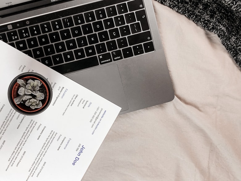
Sure, the substance is super important when you are applying for a job. You have to put show your employer that you have the talent, experience, and skills to land a new role. However, let’s not forget about the style of your resume.
If you want to make a positive impression on your hiring manager and show that you are a creative, unique individual, who wants to make it big, pay attention to the fonts you use on your resume and also on the size of fonts you should use. And with so many options available, it becomes difficult to choose the best one. But you have to try.
The thing is: recruiters get plenty of resumes and they don’t take more than a couple of seconds to scan the whole thing. So by selecting a size and font that’s easy on the eyes, you are making their job easier. Moreover, having a good font shows professionalism and is more likely to get you to the interview.
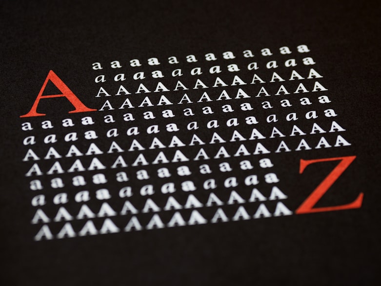
Fonts
Here are some of the best fonts you might want to use when drafting a resume:
Calibri
Created around 2004, it came to replace Times New Roman as the default font. Calibri has a contemporary font that maximizes readability and gives your resume a more professional touch. It’s considered one of the best fonts for 2021. So feel free to draft your resume in this format before sending it in.
Lato
Fun fact about Lato: it was specifically designed for a large corporate client, which makes it a popular choice among employers. It has both serious and friendly qualities. It’s easy to use and will give your manager a good impression.
Cambria
Do you know what’s great about Cambria? Well, according to Microsoft, “designed for on-screen reading and to look good when printed at small sizes.” It’s an amazing font if for your resume and cover letter. Cambria also enhances readability—thereby making it easier for your hiring manager to scan your resume.
Didot
Do you want to enter the fashion industry? Are you looking to seal the deal with your resume? Well, using Didot on your resume is sure to help you move ahead. The Didot has an interesting story behind it. For starters, it is way older than a lot of other fonts. It was born during Marie Antoinette’s reign. It’s also used frequently by Marks & Spencer and Ralph Lauren. Didot is used frequently by people who want to make their resume look fanciful.
Helvetica
Helvetica is unique, elegant writing that is sure to give your resume a more sophisticated touch. It remains a very popular font, especially in the marketing industry. So if you are applying for a job in advertising or along those lines, feel free to choose this font. It’s easy to read and makes your resume look more concise.
Garamond
If you are looking for something more traditional, try the Garamond style. It’s one of the most popular writing fonts offered by Microsoft. It has all the checkmarks for a good font: classy, attractive, and super easy to read. Moreover, it’s not something that every other candidate uses for their resume, so it’s might just give you an edge. Garamond is also a popular form of writing among ad managers and designers.
Georgia
Microsoft designed it in the early 90s and since then, it has done pretty well for itself. Georgia is used by many big corporations such as the New York Times online, Twitter, Amazon, and Yahoo in their official mediums of communications. It’s easy to read and looks fancy—thereby making it an ideal resume, especially if you are sending it in PDF format.
How to Pick the Right Font
The above list is by no means exhaustive. You can choose from plenty of fonts to write your resume. However, that doesn’t mean you can pick anyone and just go from there. Sure, we all want to show our recruiting managers our personality, but that really doesn’t mean that we put in anything. And if you do, it might give the wrong impression to your manager, especially if it becomes difficult to read your resume.

Did you know that people use the ATS software to sort through job applications? They get so many of them, it’s impossible to sift through every one of the job application sent it. The drawback to using this program is that it’s not always easy for the programs to interpret and read intricate fonts. Sometimes, the fonts are so complicated that the system skips right over them. So if you don’t receive the call for the job you knew was made for you, check your font. That might be the reason!
However, if you are applying to a more creative field such as graphic designing or video animation, you have more room to show your creativity. So here are some tips that should help you choose the best font and size for your resume. Let’s begin:
Use a Readable Font

It’s best to stick to the above list because they all increase readability. However, if you plan to use another font, be sure not to use a complex font. It encourages employers to discard your resume and as we mentioned before, it makes it even more difficult for the ATS software to scan the resume. Instead, choose a nice easy to read resume as that would help your employer immensely. Moreover, since the resume is a professional piece of document, you might not want to get too creative with the font. So it’s best to steer clear from fonts like Windings, Comic Sans, and all. They’re great for a cool invitation. But not so much for a job position.
Don’t Use Light Fonts
If you want to use light and thin fonts, you should know that the readability will be severely impacted. Therefore, it’s best to opt for something more suitable as that would increase readability on screen and ensure your hiring manager doesn’t leave out any details.
Be sure to also steer clear from downloaded or custom fonts. They are not the ones that most operating systems work with and for a good reason. Moreover, there is a good chance that the ATS system will not pick on them and reject you even if you are the most qualified candidate.
Use the Right Size
It’s also crucial to have the right font size for your resume. Ideally, it should be between 10 and 12 points. Moreover, the size you choose will impact the space. If you are just starting in your career or have only worked for a couple of years, you might not want to exceed your resume and ensure that it sticks to only one page.
When you are making your resume, keep the font size to 10. Then, you can experiment with the size if you feel you have space. While you might want to keep your entire resume on one page, don’t decrease the font size to less than 10 as this would cause strain on the reader’s eyes. If your resume is exceeding the one-page criteria despite having a font size of 10, you should concentrate on making the resume more concise.
If you are having some trouble in keeping your resume precise, consider not using words like with, a that, and like. These are considered filler words and showcase poor writing and analytical skills. The next thing you can do is to list only 2-3 points about the impact your job had, especially if you had the same role for the past 2 to 3 jobs. There is no need to fill pages after pages with the same thing.

Then, combine two similar ideas and make a nice statement about it. Avoiding listing it twice as that would take away from the space.
If you are a seasoned professional, be sure to include only 10-15 years of experience instead of putting in every tiny detail. Last but not least, use bullet points instead of talking about your role in lengthy paragraphs, use bullet points, as that makes your resume appear untidy and all over the place.
Bring in Style
Feel free to spice up your resume a bit by adding a bit of personality. You can have a different font style for your name and headings. You can also bold and underline some headings while italicizing other hones. You can also increase the size of your name and other important sections such as education and professional expressions so that it catches the eye of your recruitment manager.
However, be sure not to overdo it as this would give a bad impression and show that your resume is all over the place.
Above all, folks, be sure to add a killer cover letter to seal the deal. You may not realize it but hiring managers give a lot of weight to cover letters. You can showcase your personality and let the hiring manager know why you are the better fit for the job. That’s it for now. See you next time.